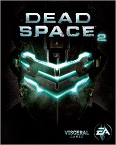
How could they top that? They haven’t, but they’ve got Isaac Clarke’s helmet on the cover – probably one of the more recognisable helmets out there. It’s like an unfolding or self-unpacking one.
The game should be out next year for multiple consoles, including, yes… the PC.
----
Source: Dead Space 2 Box Art Keeps It Simple [Cinemablend]


0 comments:
Post a Comment
If you’ve found this post helpful or humorous, why don't you bookmark it right now? You can do this by using the ‘share it’ or the ‘addthis’ buttons. Please feel free to share this article with others.
You may also leave a comment as well.
Bookmarking and commenting only takes a little time, and you can also consider subscribing to my RSS feed for more!
Thanks.